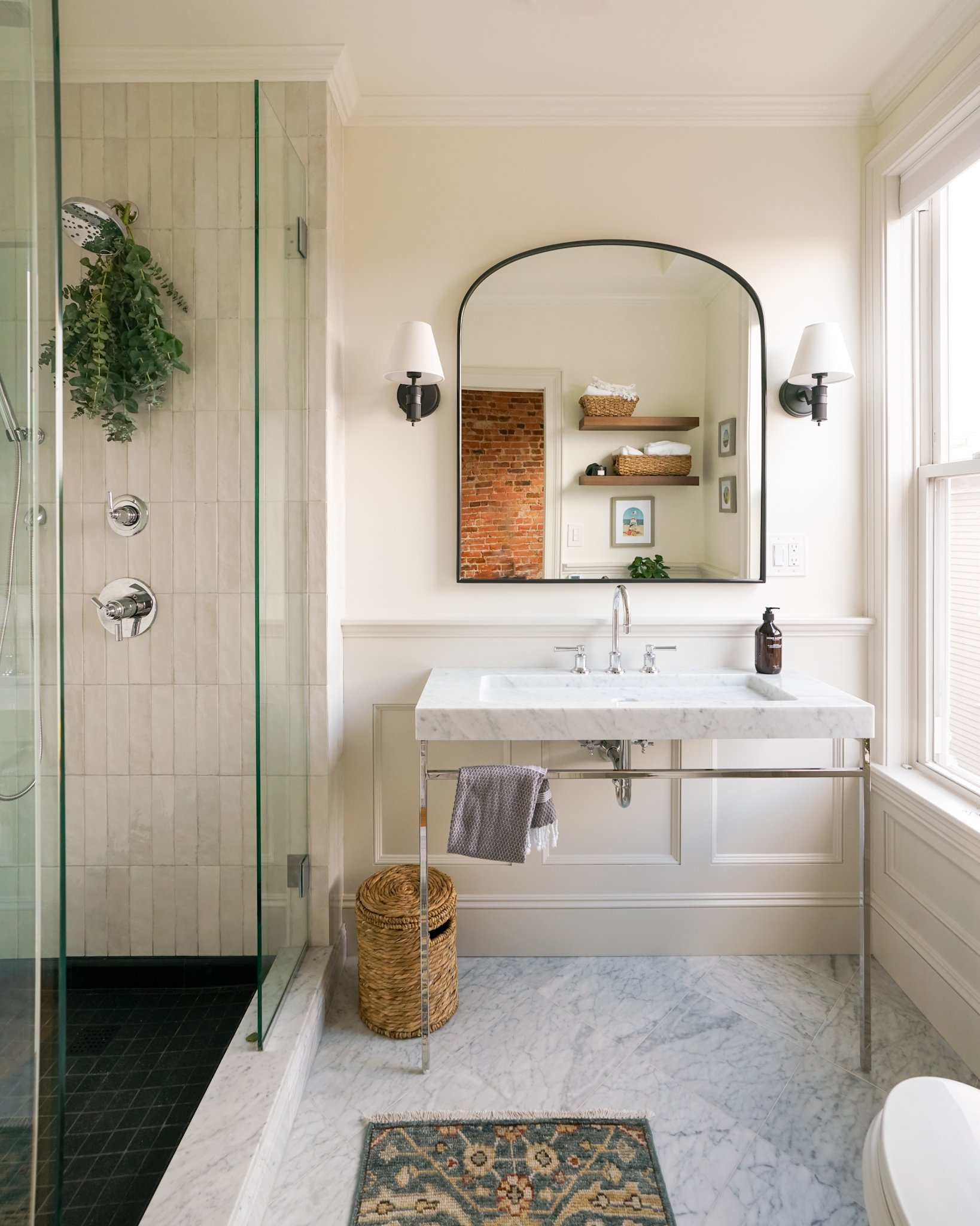
Charlestown Bathroom Project
When our friends Z & J decided to cut a hole in their shower wall there was no going back. They purchased their Charlestown condo years ago, but due to issues with pitch, the shower never drained. We are not sure if it was a poor installation OR if a recent remodeling project was to fault, but the solution was the same - the shower needed to be gutted.
All Sources
Paint
DELTA HARDWARE
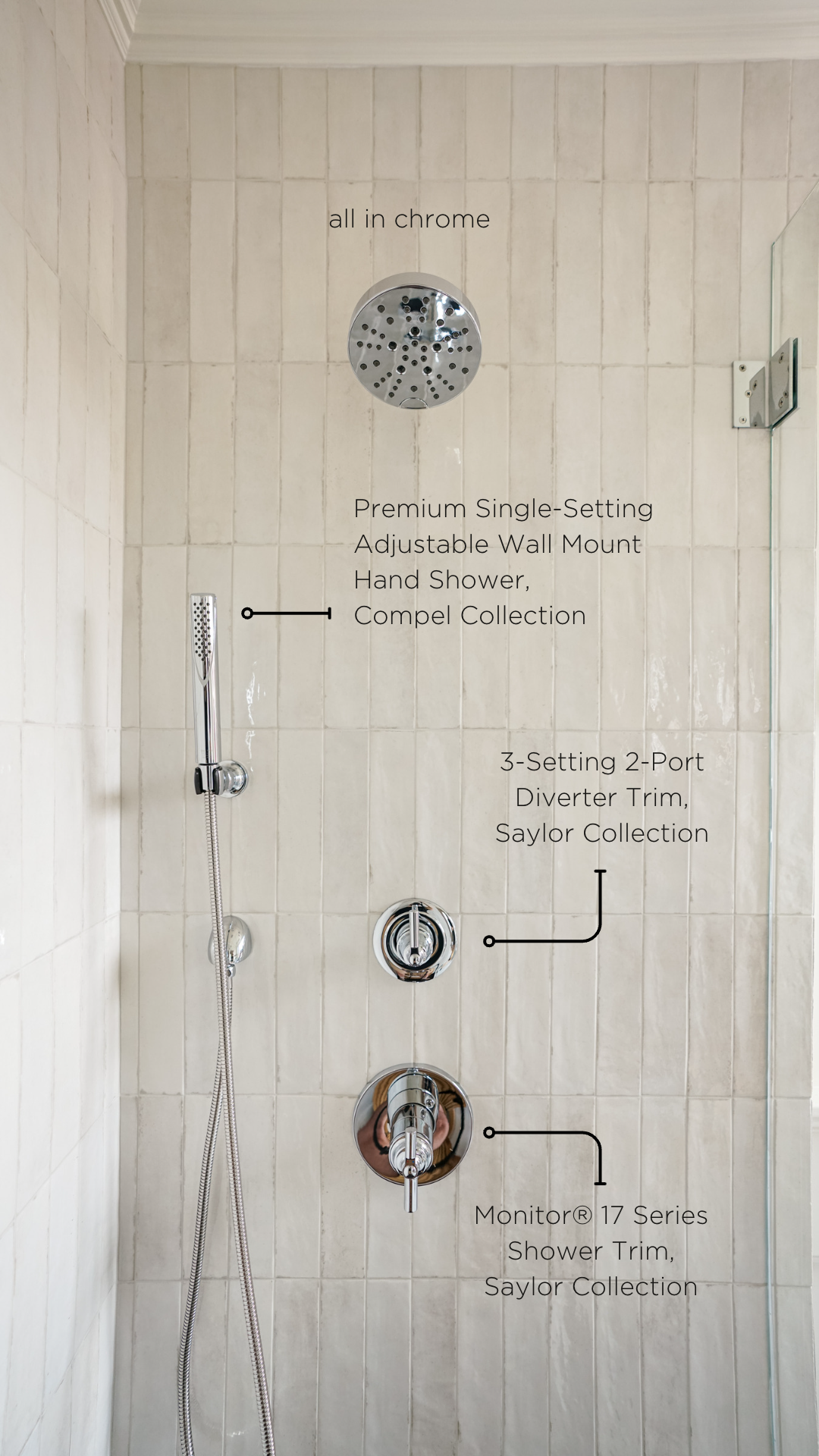
Shower Head & Valve Trim: Monitor® 17 Series Shower Trim In Chrome
Shower Diverter: 3-Setting 2-Port Diverter Trim In Chrome
Shower Sprayer: Single-Setting Adjustable Wall Mount Hand Shower
Towel Hook: Double Robe Hook In Chrome
Tissue Holder: Tissue Holder In Chrome
Toilet Lever: Tank Lever In Chrome
REJUVENATION HARDWARE & DECORE
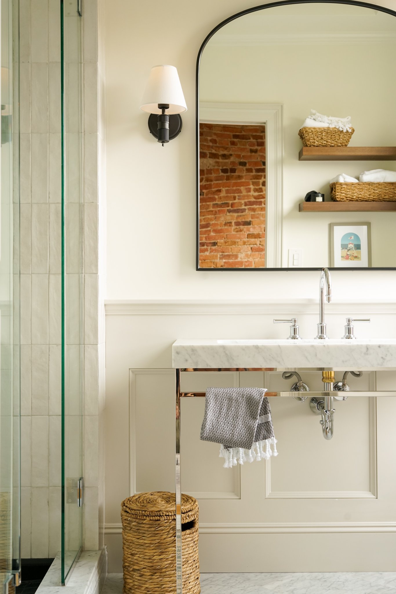
Vanity: Winslow 42" Marble Vanity
Vanity Mirror: Arched Mantel Metal Framed Mirror
Vanity Sconces: Rigdon Single Sconce in Oil Rubbed Bronze and Ivory Shade
Shower Bench: Adela Teak Shower Bench 18”
Waste Basket: Stafford Woven Laundry Hamper & Waste Bin
Floating Shelves: Floating Wood Shelf with 2" Height in Walnut
THE TILE SHOP SOURCES
Wall Tile : Tribeca Gypsum White Porcelain Wall Tile - 2.5 x 10 in.
Floor Tile : Shanxi Black Flamed Granite Mosaic Tile - 2 x 2 in.
Floor Skirt Tile : Noir Honed Limestone Stanton Trim Tile
Threshold : Carrara Marble 6"x6'x3/4"
Wall Grout : Ardex Fresh Lilly Unsanded
Floor Grout : Black Licorice Unsanded
// Disclosure: This blog post includes sponsored content and affiliate links.
How it started
We were a few drinks in at our local bar when Zach of Z & J let us know that he decided to cut a hole in the shower. David quickly followed up with “why? what was your plan” to which Zach shrugged - “I just wanted to see what was there”. The new hole in the wall eliminated any quick fix options - the shower would need to come out.
David walked right into that vodka soda trap and suggested “what if we do it?!”
When you see photo of the original bathroom this may come as a surprise - the room looks fine - but there was just no going back.
The original shower - featuring a new hole in the wall
Non-functioning shower aside, the bathroom left much to be desired. Stacked 1’x1’ marble tiles on the wall, repeated on the floor but diagonally, screamed “a contractor was here”. All paired with features like non-centered shower hardware and a piece of glass without a door - left us no choice but to help them, and we were so excited to do so!
The rest of the bathroom had similar contractor grade elements - undersized trim, cheap looking MDF panels, and underwhelming hardware. We decided that if we are going to do this, we should increase the scope and do it right.
// Pros : the marble bathroom floor is heated and in great shape, the ceilings are tall, and the toilet is pretty decent as far as toilets go!
Design
The fun part - designing a primary bathroom! We asked Z & J to begin create a Pinterest board of inspiration while keeping in mind the existing marble floor and layout. They submitted their ideas, and luckily for us, they both have a great aesthetic and willingness to entertain new ideas.
We measured every inch of the space and Stephen got to work on sourcing and rendering. Our goal was to design a beautiful bathroom that they looked forward to using each and everyday - within a reasonable budget.
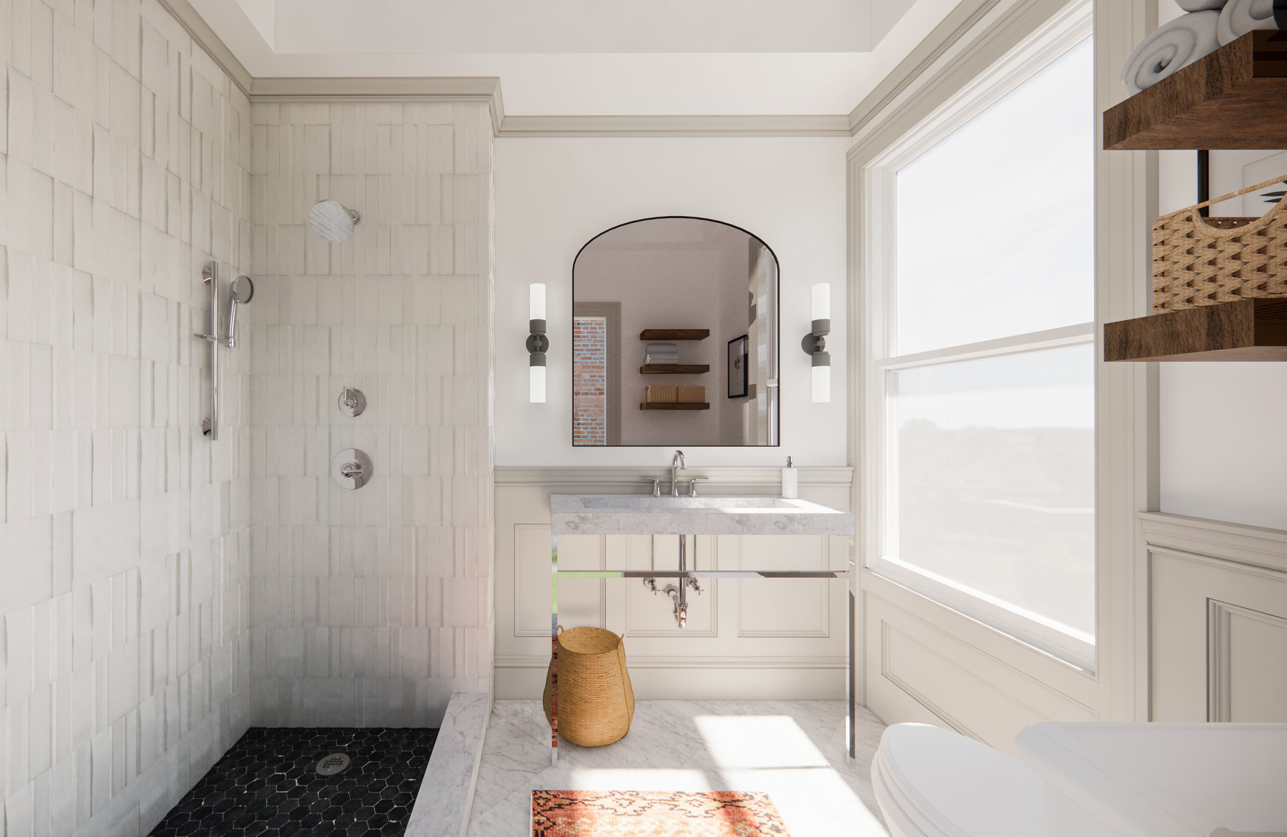
Project Rendering : Overview
Putting together classic materials like marble, glass, and chrome does not automatically result in classic design.
Project Rendering : Shower View
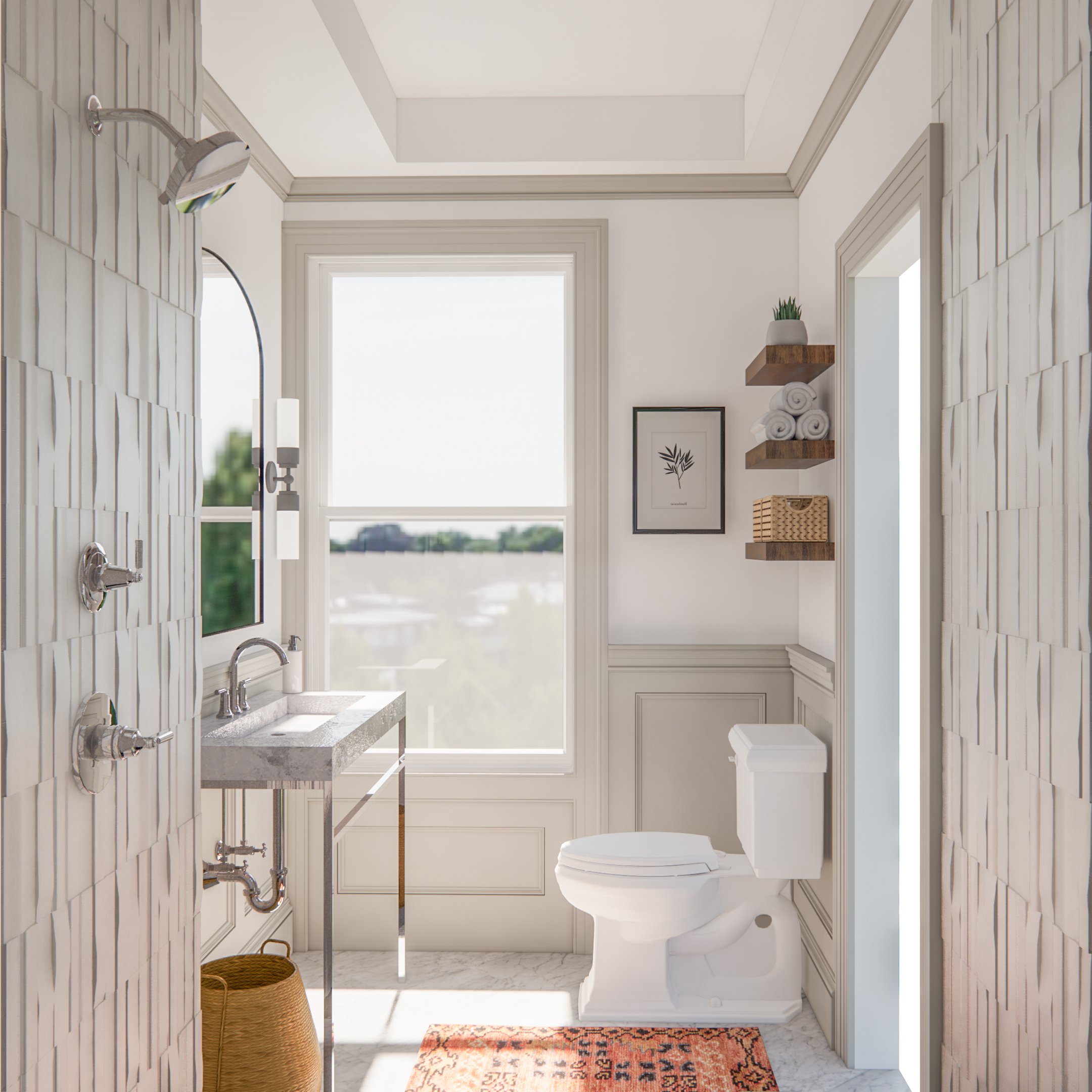
Project Rendering : Window View
The Tile Shop
It was still cold outside when we met Z & J for a Saturday morning trip to The Tile Shop. It was our first sourcing trip and we were excited to start exploring. For the next few hours we wondered the isles, carrying samples, laying them out in various combinations and chatting through our ideas. We left with a bunch of our favorite samples to see them in the actual space.
We knew that The Tile Shop would be the perfect place. We worked with TTS back in 2020 on our Primary Suite project and the experience was fantastic. The staff is experienced, there are a lot of options, and they carry a lot in inventory (so it ships quickly). This is also where we were introduced to, and fell in love with, the WEDI shower system.
Delta Shower Fixtures
Last year we had the opportunity to visit the HGTV Dream Home as guests of Delta where we were able to experience the wide range of their product offerings. Delta has been creating faucets for quite some time and they have the process down to a science, while continuing to innovate. Needless to say - we were excited to use Delta in our next project.
For this bathroom project there was no debate - we are going full CHROME.
Selecting fixtures turned out to be an easy venture. Delta has a classic line called the Saylor Bathroom Collection and it checked all of our boxes. Not only is it available in chrome but the design is both timeless and modern. We recommend checking out the Collection PDF of any Delta line which outlines all of the available trim options and accessories.
Rejuvenation Vanity & Lighting
The vanity we have all been waiting for!
This bathroom layout is complicated given the lack of depth (and width) for a true two sink vanity. There was previously a left aligned pedestal sink because anything longer would become too close to the toilet. We needed to find something much more narrow and this significantly limited our vanity search. The solution was the most perfect vanity, the Winslow 42" in Marble. Narrow enough to fit comfortably centered on the wall, and wide enough to accommodate two people getting ready the sink is absolutely perfect.
For the remainder of the bathroom we furnished with classic Rejuvenation hardware and decor including sconces, mirror, and floating shelves. In the shower where we did not include any niche or shelving we use the Adela teak shower bench.
Additional Details
// Bathroom Floor : We mentioned before that we decided to keep the bathroom floor because it was in good shape and heated. The only issue - it was polished - and we cannot with polished marble. Luckily - we have solved this problem before by honing the marble ourselves. It may sound scary (we were terrified the first time) but it’s simple… We add some vinegar to water, put it on the floor, and pull out the orbital sander. We stuck to 220 grit and and just went for it because it’s really hard to mess up. We highly recommend you use the water (wet sand) to prevent dust, and wear a mask.
// Trim & Panelling : We really wanted to beef up the trim, but not so much that it made the rest of the trim in the condo stand out. We started by designing the door and window and then determining the various section sizes for the walls. We have gotten pretty good at this over the years and the trim went up pretty quickly!


