Our Modern Victorian Kitchen Design Plan
We recently answered your questions about WHY we are renovating our kitchen - we know, it's shocking. Our first, more contemporary kitchen design was beautiful, but it just didn't fit into the rest of our Queen Anne Victorian house. So, today we are diving into the fun part, the new design! With our marble countertops, the inset cabinetry, and a fresh color palette, it's going to look like like an entirely new kitchen. We're going for Victorian aesthetics, with modern kitchen design and traditional elements. We’re going to do this all while keeping the existing parts of the kitchen that we really appreciate now.
So let's get to it, shall we?
The Concept
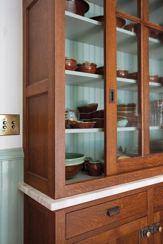
The overarching design concept behind our kitchen was drawn from traditional kitchen elements. While Victorian style kitchens of the era typically featured a free standing sink, ovens, and workspaces - it is the pantry that caught our attention. Pantries of the Victorian period had intricate details, they were built-in, and just stunning.
Our plan is to take our favorite pantry features, and use them in our main, one wall kitchen. The goal is to make it read like a Victorian era pantry, but with all the best modern functionality. Does that make sense? To confuse you even more, we also have a very small auxiliary pantry space... but more on that later.

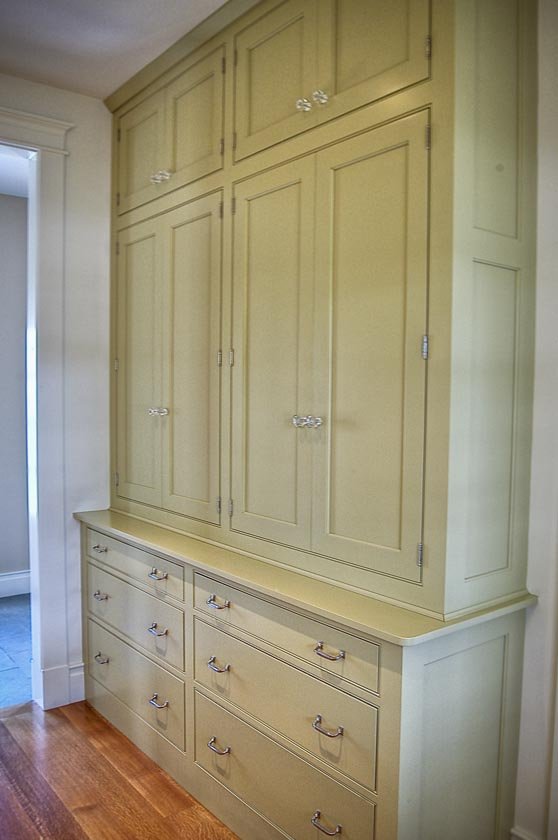
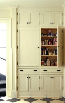
Above: A few examples of materiality inspiration. Sources linked in image. More on our Pinterest
Layout
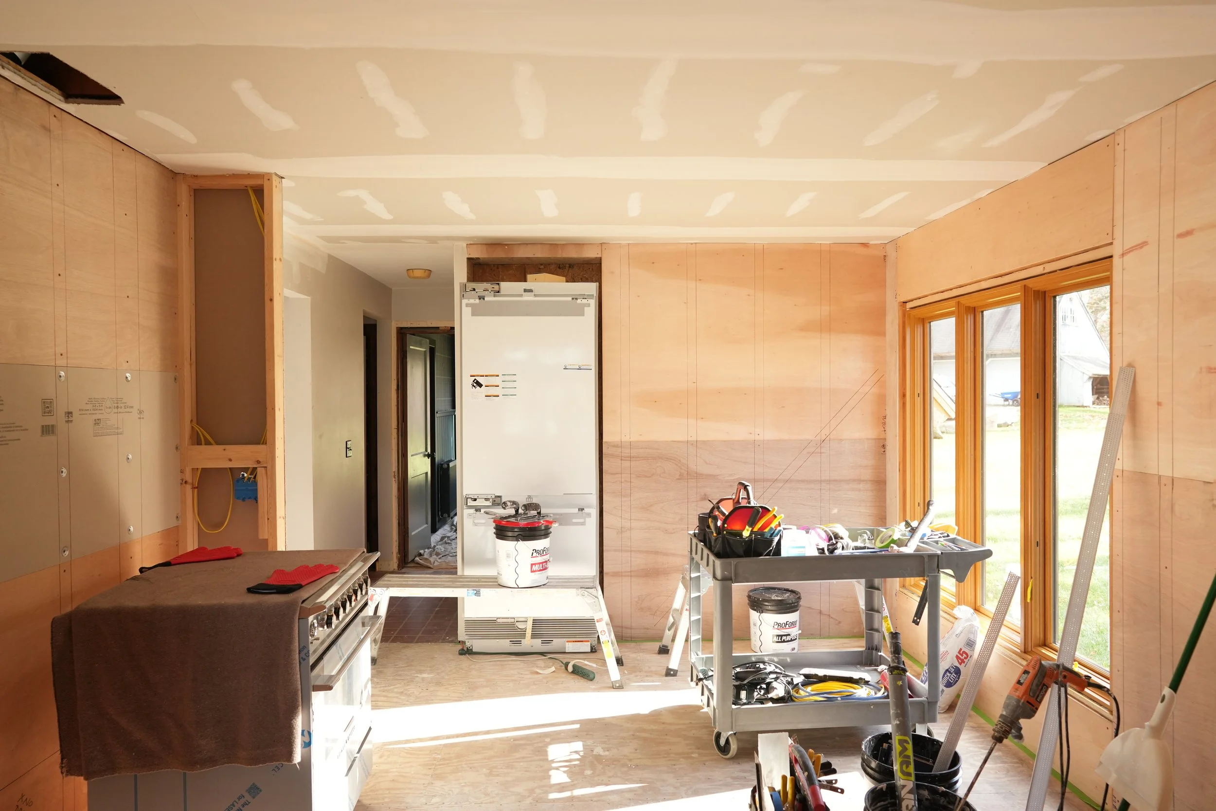
Having the opportunity to make a fresh start, we POURED over the layout and reviewed hundreds of iterations. With every new version we always seemed to circle back to the layout that we have today. We've loved the setup these last three years, so why fix what’s not broken? We feel like this layout optimizes the available space and leaves easy access to appliances and food preparation areas - and we can both be in the kitchen without bumping into each other. Bonus, it keeps us from moving any utilities.
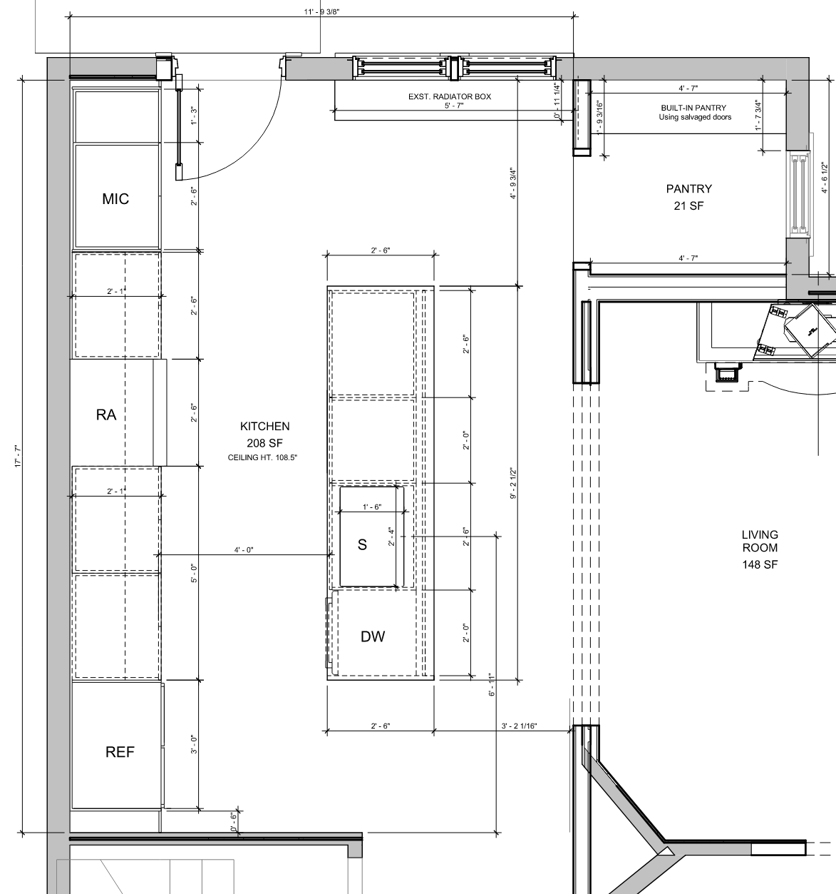
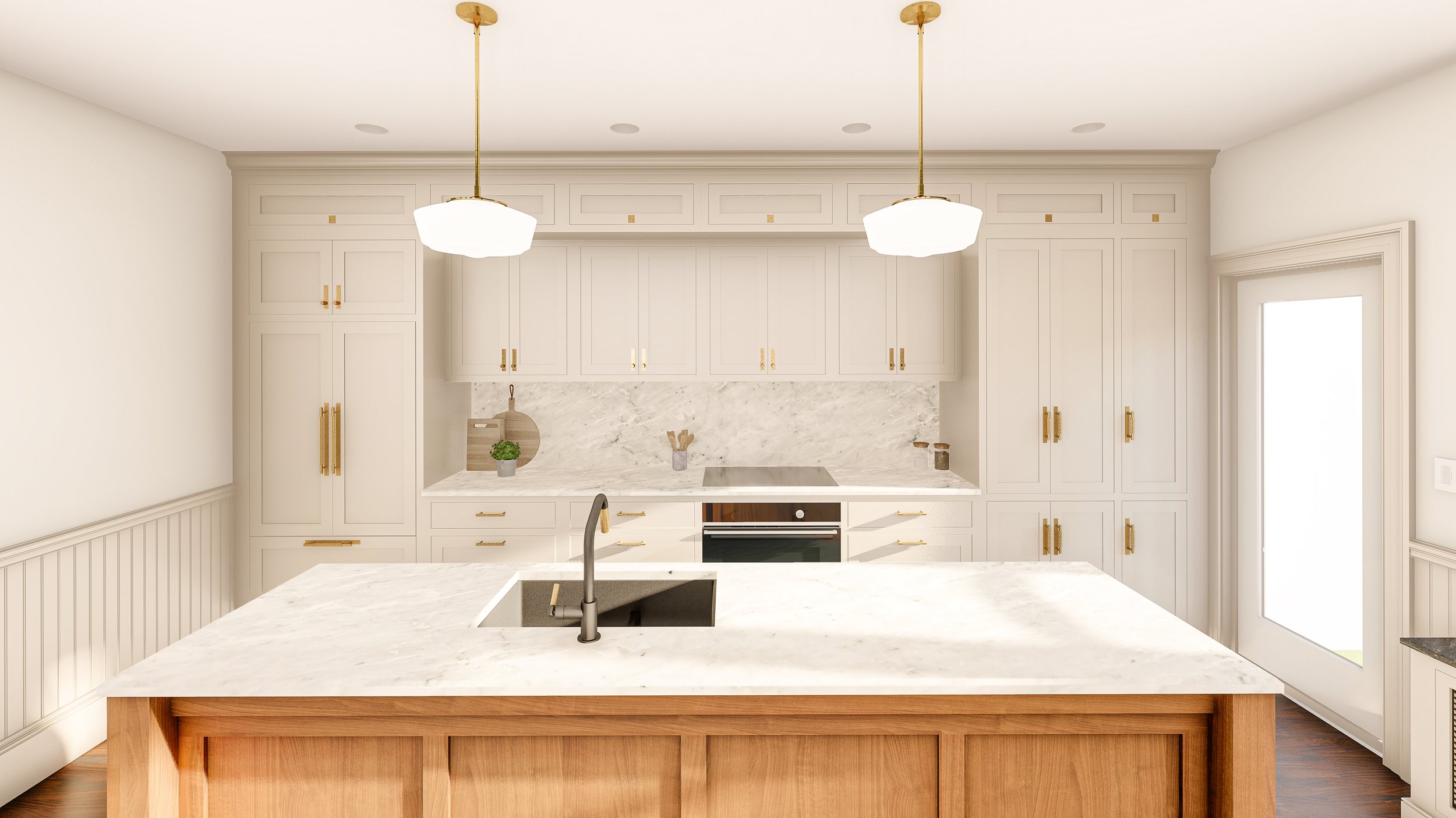
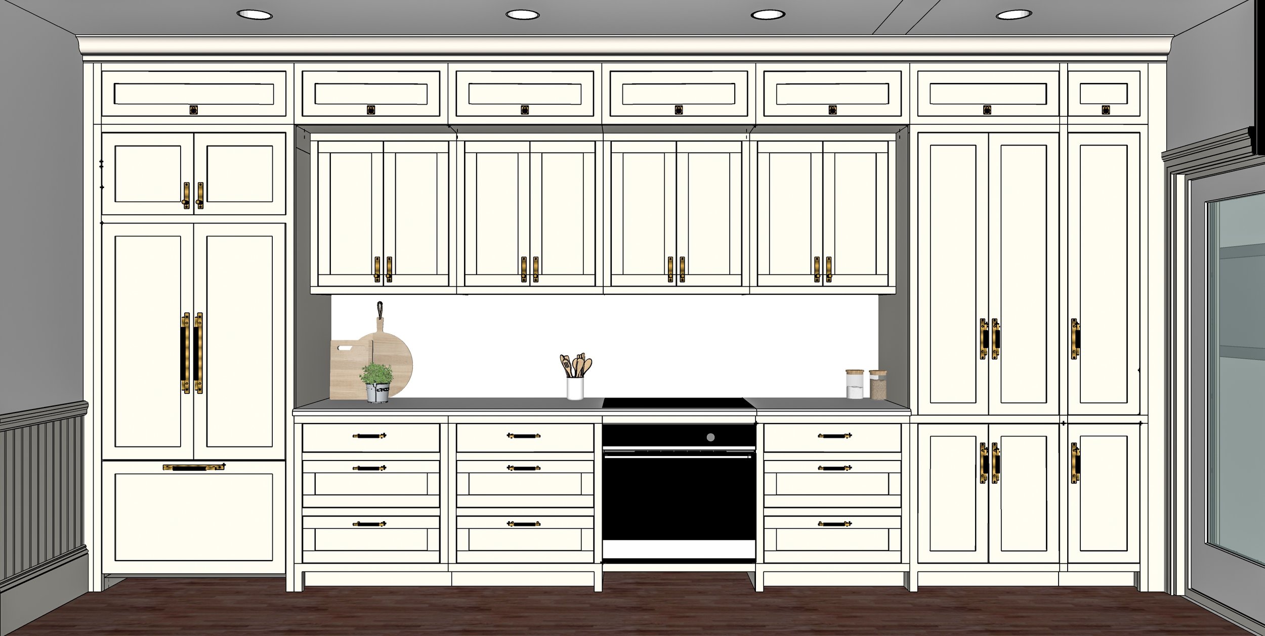
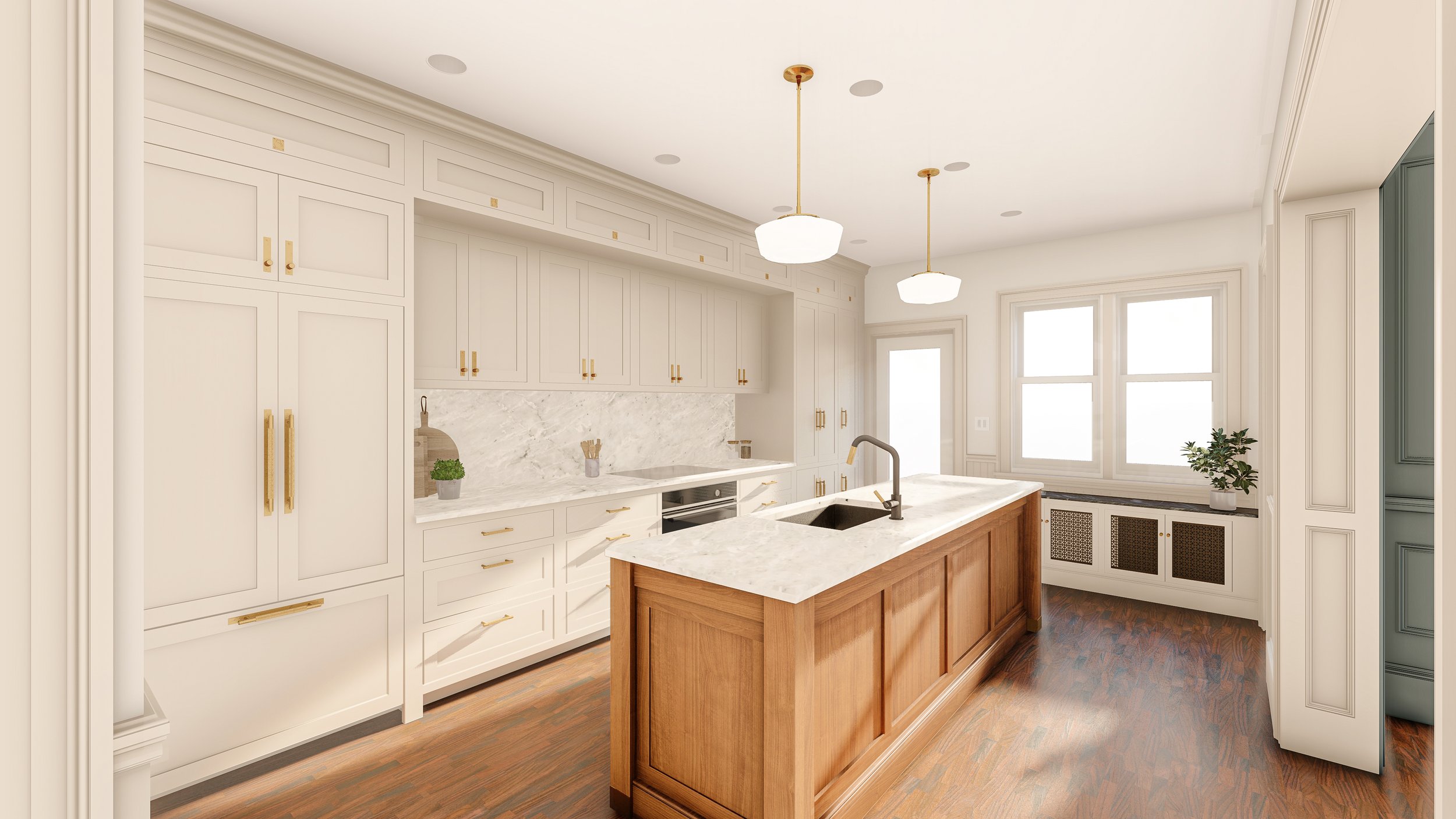
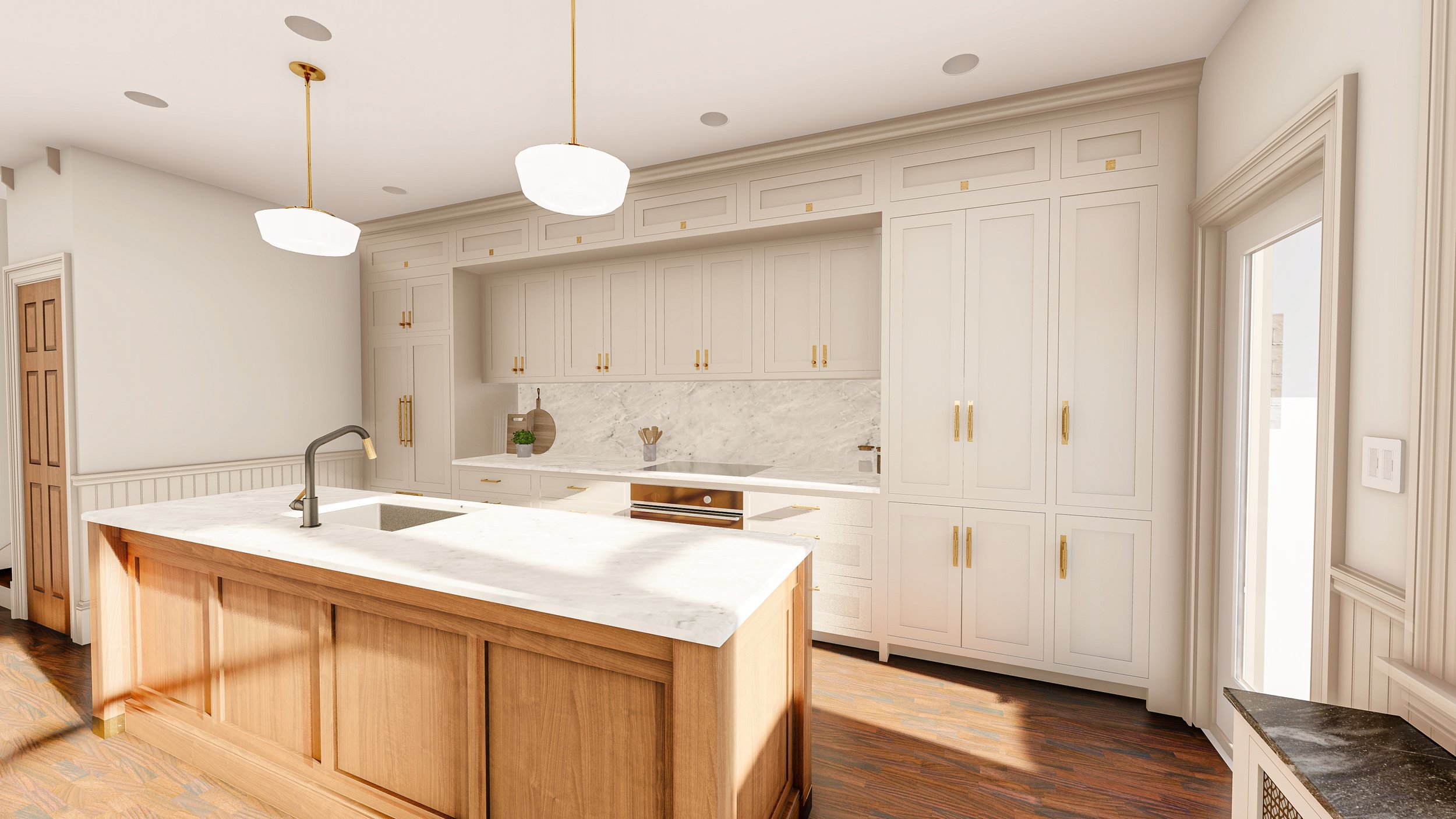
A note on the floor-plan: we have utilized the “Kitchen triangle” layout that allows optimal circulation between the fridge, sink, and oven. Based on the limitations of the space, we only have one main wall for floor-to-ceiling cabinetry. We think edge to edge kitchens provide the best way to achieve a custom look. With 9' high ceilings, we are able to fit tall functional cabinets and "soffit cabinets" for overhead storage. The soffit cabinets are full counter depth and connect the anchors of the space, the fridge on the left and the large pantry cabinet on the right.
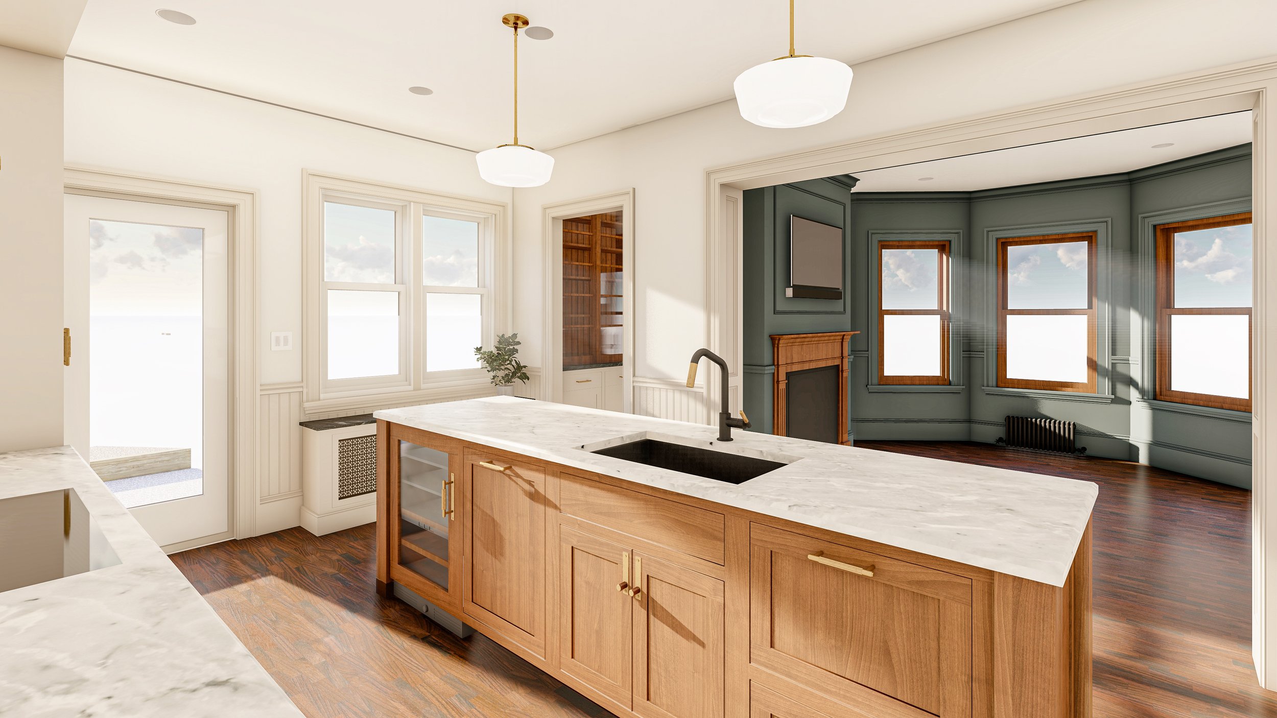
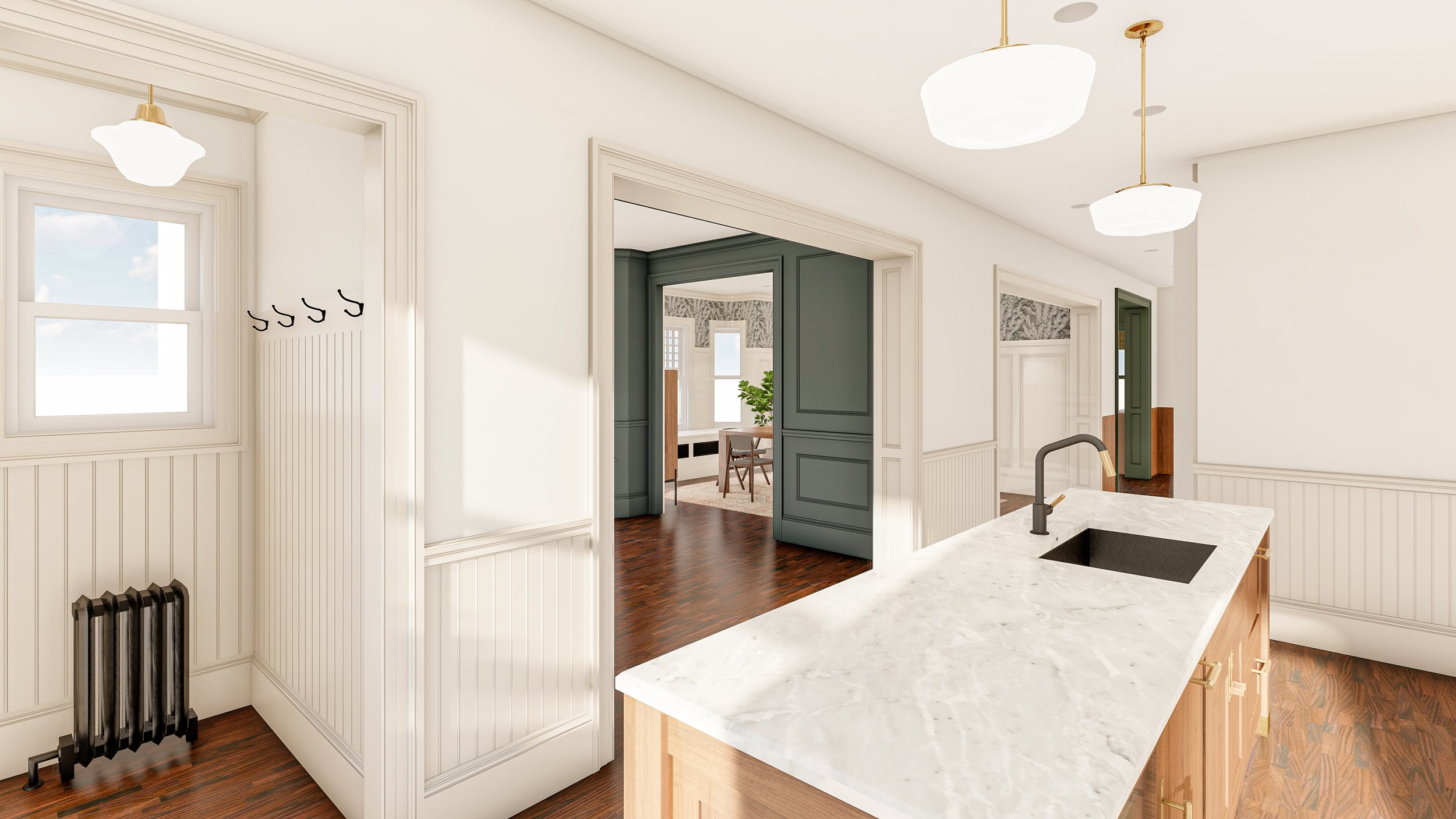
The central island serves as a large work area and houses the sink, dishwasher, beverage fridge, and trash drawer. We made the decision to put the sink in the island pretty early on and we LOVE it. Typically, as a rule, when laying out a kitchen we put the sink centered on a window. Given the lack of windows, we decided to center the sink on the adjacent living room windows. This allows for conversation, natural light and visual interest when stuck scrubbing. Our kitchen is in the back of the house, and with the sink facing in the direction of the dining room, it helps prevent the kitchen from feeling like a totally separate room, despite it not being an open floor plan.
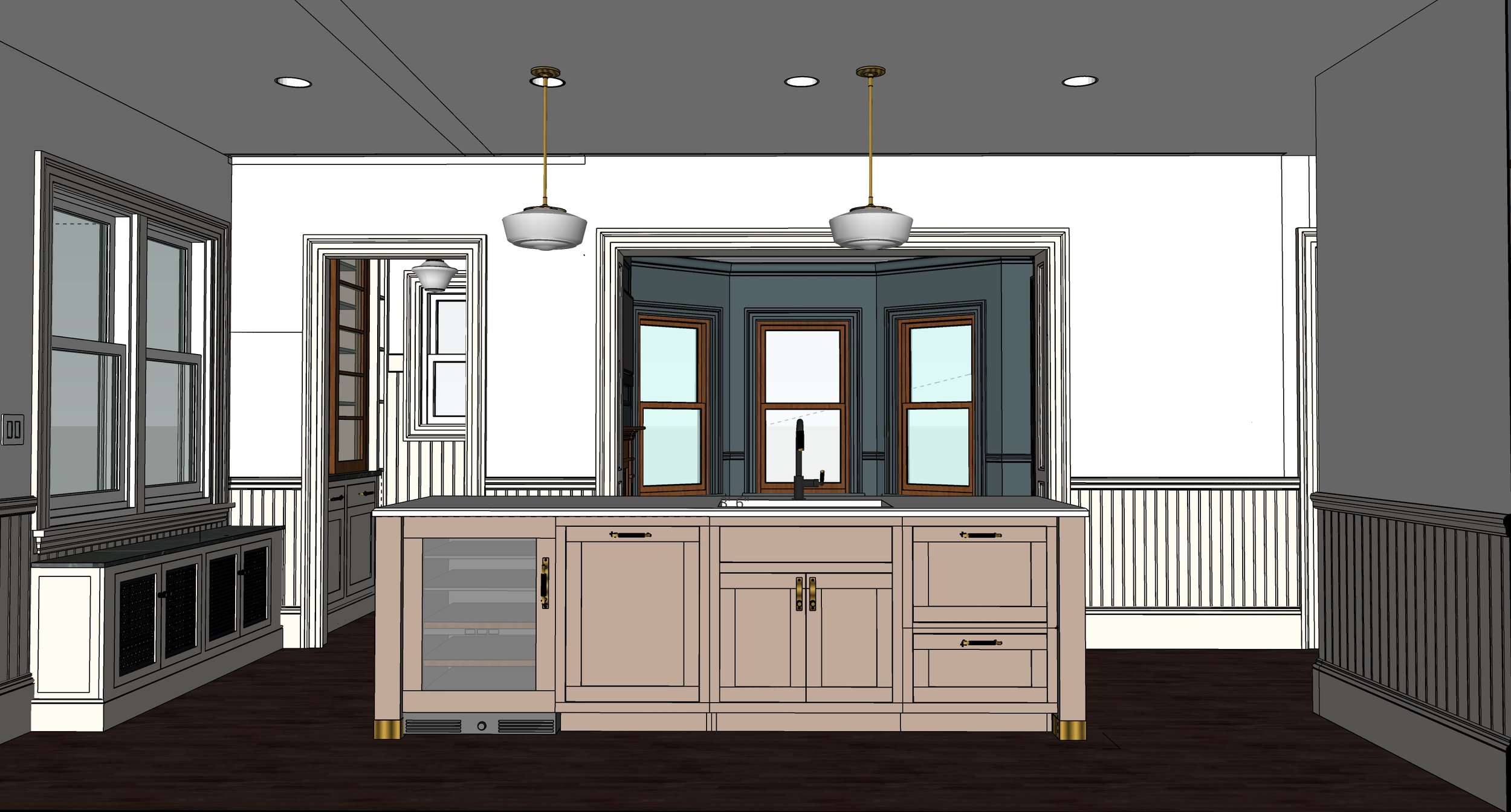
We should also note: We have made a very conscious decision to NOT include seating at our kitchen island. We could have made it work, but it wasn't important to us this time around. Early on we decided that if we were going to have a dining room with the large table, we were going to use it. The lack of seating at the kitchen island allows for extra storage and plenty of circulation around the space.
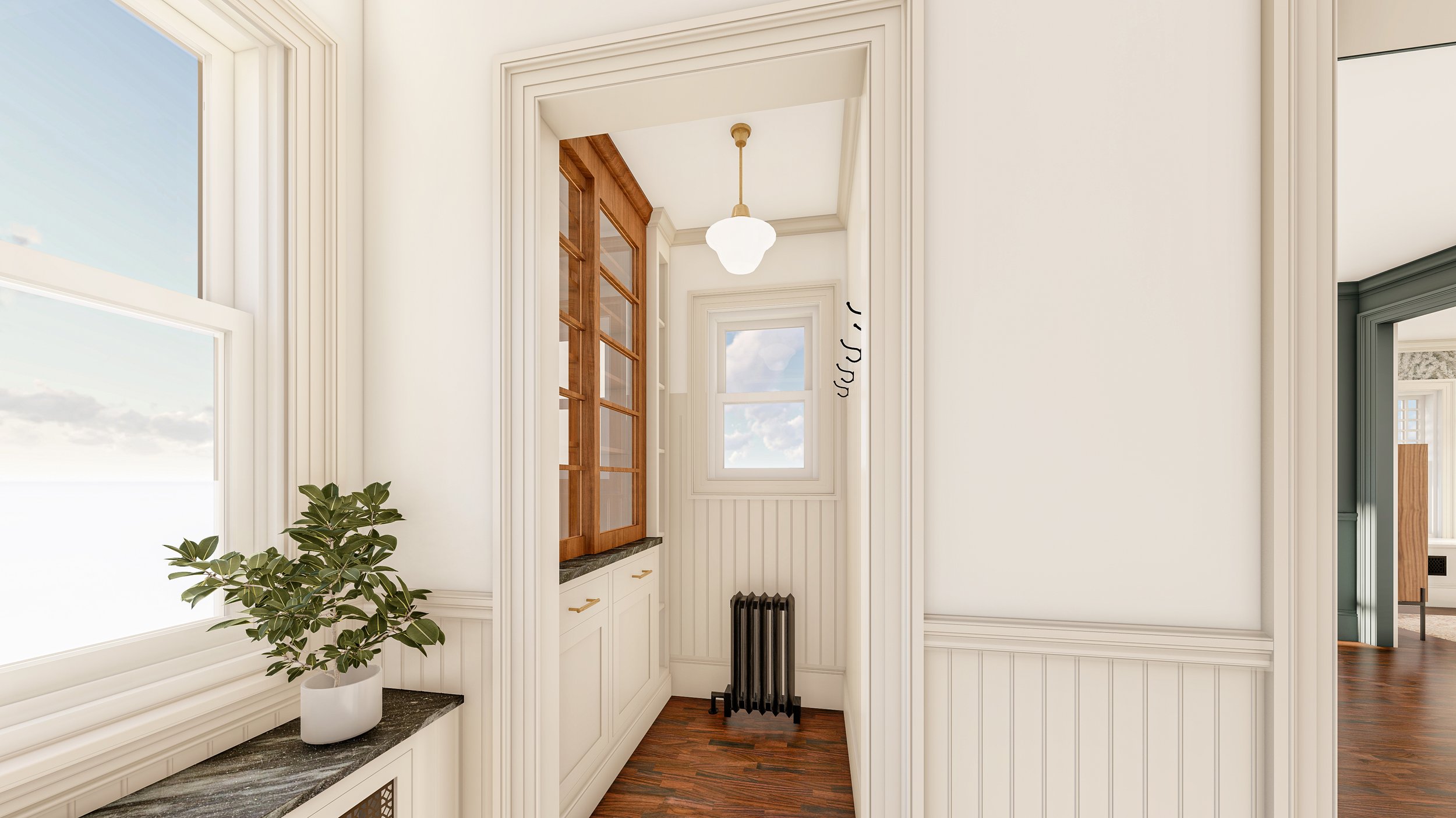
Lastly, one area we are the most excited about is the actual Pantry. Traditionally called the “Butlers Pantry” these small auxiliary spaces were very popular in Victorian homes. And as far as we can tell, we are putting this one right back where it was originally. We are even incorporating original sliding glass doors that we found in the basement. This space will serve as dry-food storage, a place for cookbooks, and maybe a coffee bar?
CABINEtRY
In order to achieve a more traditional look, we are using inset cabinets in our new kitchen design. For a crash course on what that means, we suggest taking a look at Ashley's (@TheGoldHive) blog post where she really dives into the topic. There is just something that feels more authentic with inset cabinets. It’s a very traditional detail that harkens back to old english kitchens and a detail we’ve used in all the other cabinetry in our home thus far.
We are going with “Ready to Assemble” (RTA) inset cabinetry made with high-quality materials. This means that our entire kitchen will arrive flat-packed and we will assemble it on-site. This allows us to have the quality of cabinetry we are looking for, at a much more affordable price-point. We have been working with the supplier for months now, refining the design, and we’re so exited to see how they come together.
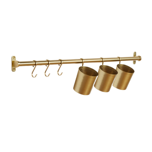
We won't be including any open shelving in our design, aside from the sliding glass doors in the butler's pantry, but we will be adding a backsplash rod where we'll be able to display some functional and decorative elements.
We are also incorporating most (all?) of our appliances into the cabinetry. We have always loved this look and brands like Fisher & Paykel have really perfected it. Gone are the days of very obvious panel-ready appliances and welcome fully integrated units! These cabinets are now a pretty striking focal point in here.
Finishes
We've said it before, and will say it a million more times; finishes make the space. Especially when it comes to creating spaces that feel accurate to period homes. Using traditional materials that could have/would have been used during the era your home was built, is a great way to create an authentic look, even if you use them with a slightly more modern designs.
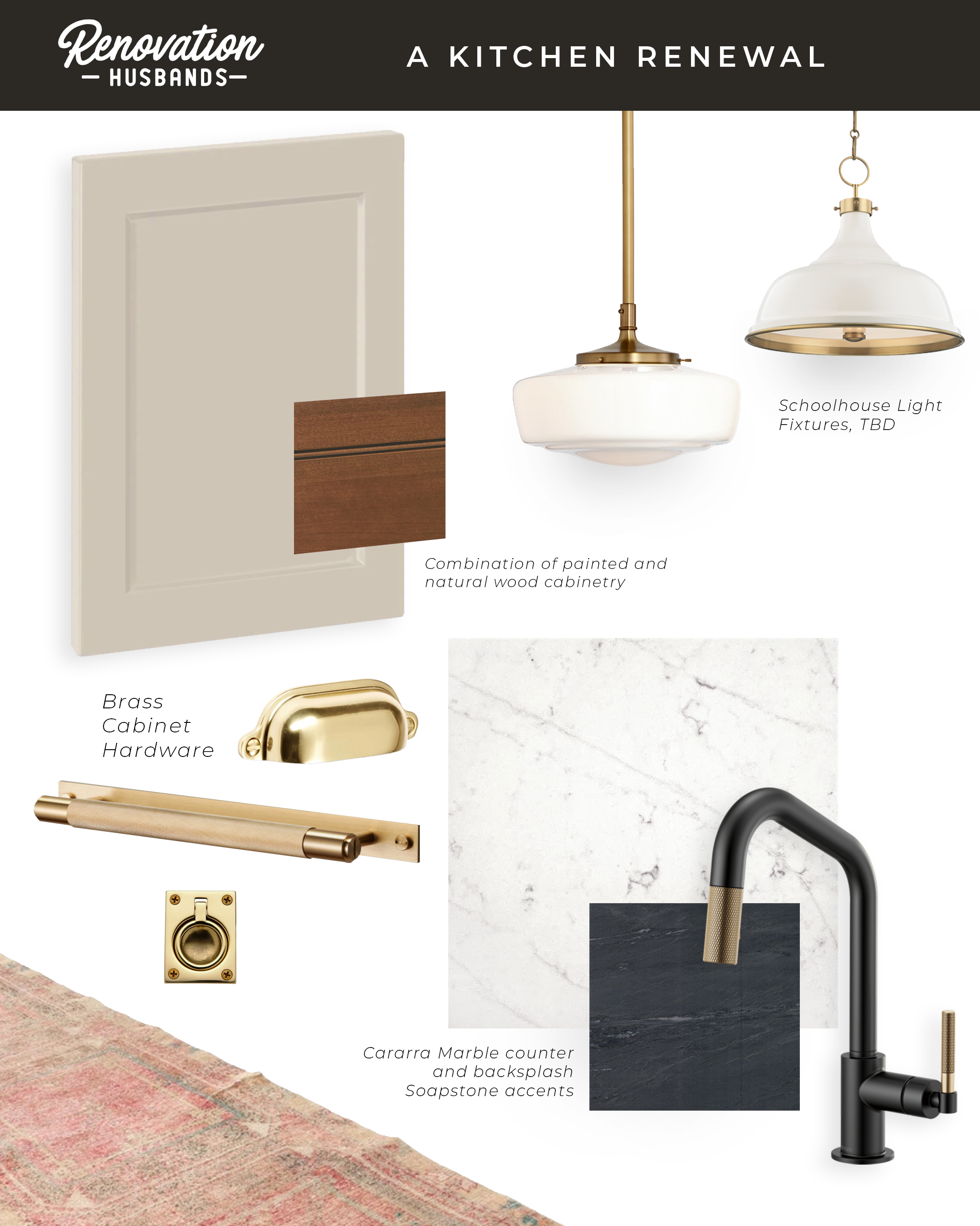
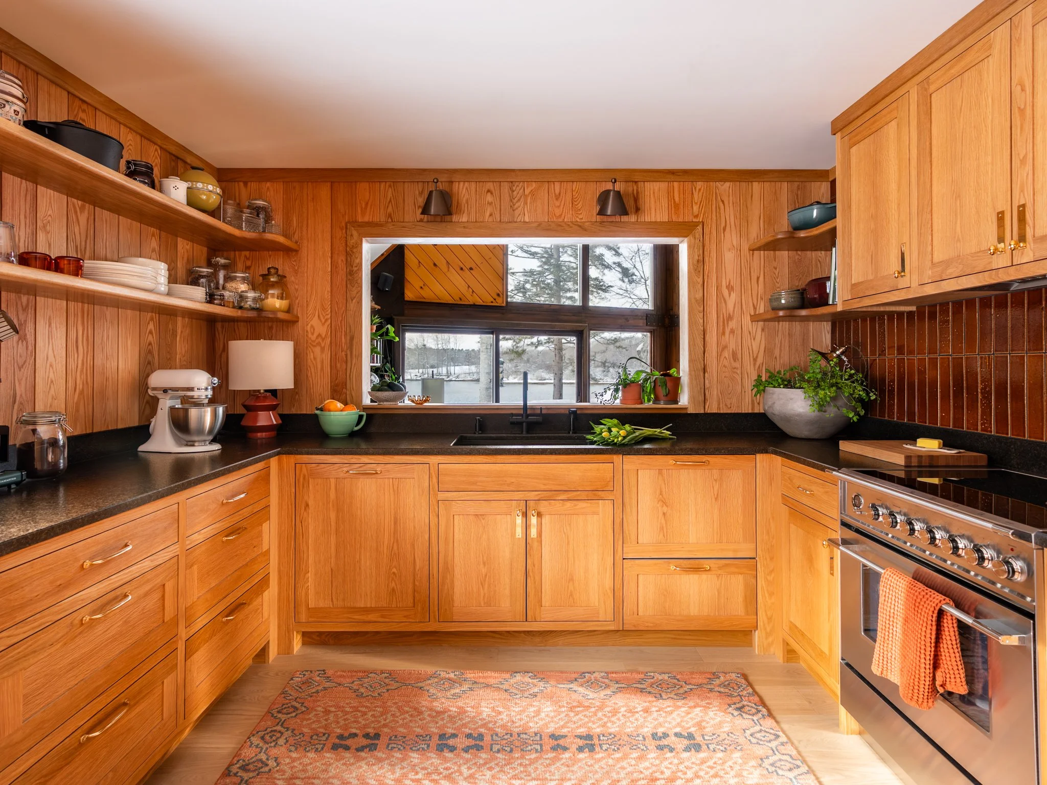
// Painted Cabinetry: The main wall of the kitchen, as well as most the pantry cabinets are going to be painted. As you can see in our inspiration images above, we love this clean look. We're going with the ever-elusive “mushroom” color - a color that is currently trendy, but also timeless. We have been trying to nail down the right color for months and we are ALMOST there. Too cool looks grey, too warm looks yellow, some beiges look pink?! It’s a hard one y’all.

Above: Via Devol Kitchens
// Wood Cabinetry: The island is going to be natural wood. We’ve come to this design decision for two reasons: We are designing the island to be reminiscent of a piece of furniture - a large central work table of sorts. Additionally, we have lots of natural wood featured in our home already. From our paneled entry, to the adjacent fireplace, to the salvaged pantry doors, and the wood floors, this will be a way to make the kitchen look cohesive with the rest of the area. In terms of color of the wood, we are also taking cues from the existing wood around us.
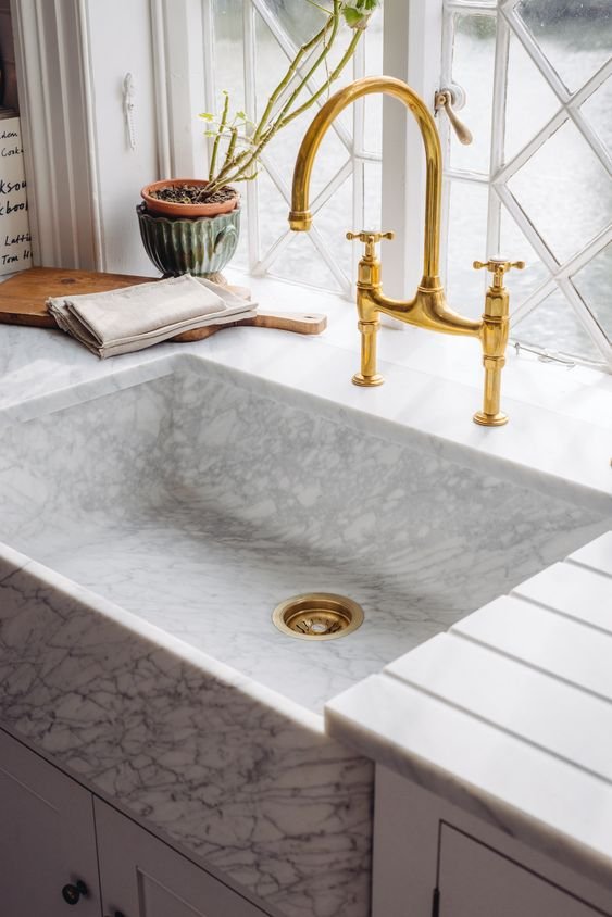
// Natural Stone: specifically...marble, baby! We have gone back and forth on this A LOT. We currently have imitation-marble quartz countertops. We will say, they have held up beautifully. They are super low maintenance, we never have to worry about them staining, they are basically indestructible and are a fantastic solution if that is what is important to you. That said, they look like imitation marble. They have a plastic-y, sterile look that we have never been able to get past. We have been searching high and low for a more authentic alternative and have not had success. Once you've seen and touched the beauty of real stone slabs, there's no going back.
Will we love the look of real marble? Yes. Will we forever be haunted by the maintenance and constantly reminded by David that the marble was Stephen's idea and if anything ever happens to it, it will ultimately be Stephen's fault? Also yes. We’ll keep you all up to date on our search for the right stone and the pros and cons moving forward!
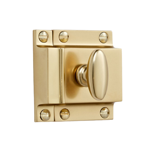
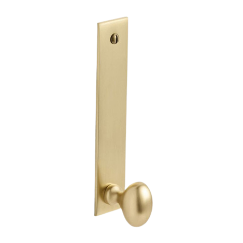
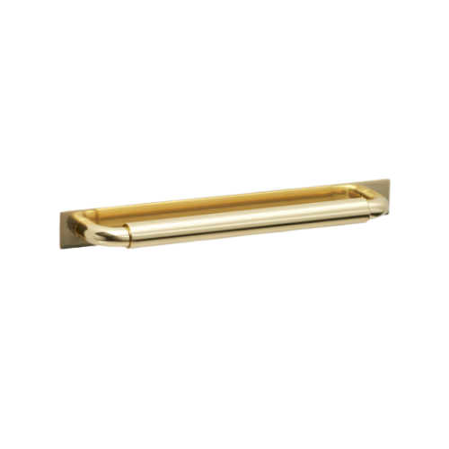
Brass: Need we say more? She’s beauty, she’s grace, she’s timeless. Brass will likely be incorporated into our cabinet pulls, but also in vintage finds. We've been carefully sourcing the right decorative items and we’re on the lookout for some killer schoolhouse-style lighting fixtures.
What You Came to See
Alas, here are our current renderings for our modern Victorian kitchen! Do you think we did period kitchens of yester years, proud? Remember, just because it’s in a rendering, doesn't mean it’s set in stone <insert marble pun>. We use renderings as a tool to iterate our design - what you see here, is version 5,893 (roughly).

Thank you for reading this far! Question? Comments? Just want to follow along for the ride? Hit us up on Instagram!